Removing obstacles through strategic research so users can find the financial information aid they need.
Successfully communicating complex financial information to a large group of users with diverse accessibility needs is no easy feat. Specially, making sure users understand that information and can act on it before giving up on their journeys through the website.
Using a mixture of quantitative and qualitative research methods, as well as audits of the existing website, we provided the Turn2Us internal teams and website development agency with improvements to the usability, navigation, information and content architecture and key layouts on the website – in order to reduce premature user exits and to make sure that the essential information was attained and understood
500+
end-users participated in the research
5
user journeys mapped and optimised
30+
wireframes improving content architecture and user flow
Strategic research planning leads to the best use of project resources
Turn2us was looking for user insights and solutions to improve the experience of their website visitors – in particular, around three key areas:
Accessibility, specially of their financial information and on mobile
Usability, specially in the performance and completion of tasks
Discoverability, signposting users to the website’s key information
We started by defining Objectives and measurable Key Results for the project, aligned with the organisation’s strategy to focus the research on the areas that would make the biggest impact for the client.
We also audited their existing research, which included some basic user journeys, valuable insights from user interviews, and an initial sitemap workshopped with internal stakeholders – in order to identify gaps in knowledge the research would need to cover, which allowed me to create a bespoke research plan for the project.
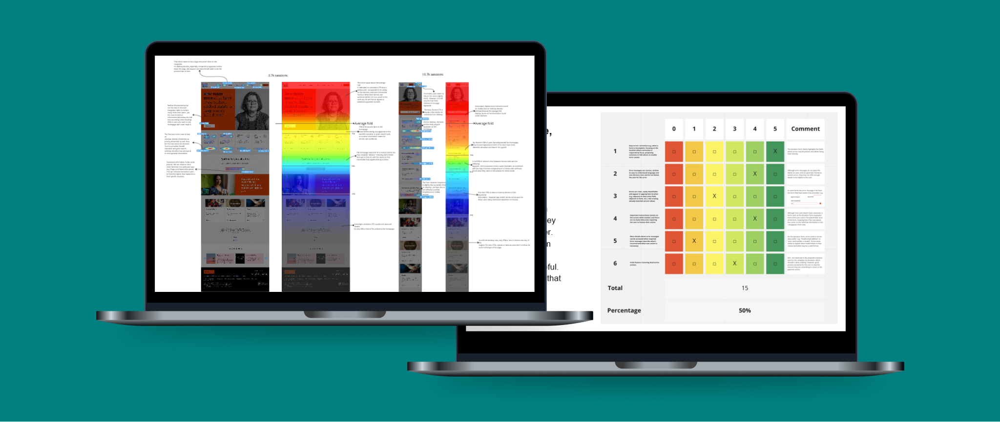
I follow Jakob Nielsen’s usability heuristics to audit websites (left) and use Hotjar for heatmapping analysis (right).
Auditing the existing website allowed us to identify pain points and accessibility issues
A usability audit and a heatmap analysis of key landing pages gave us insights into potential user barriers and observable behaviours on the website.
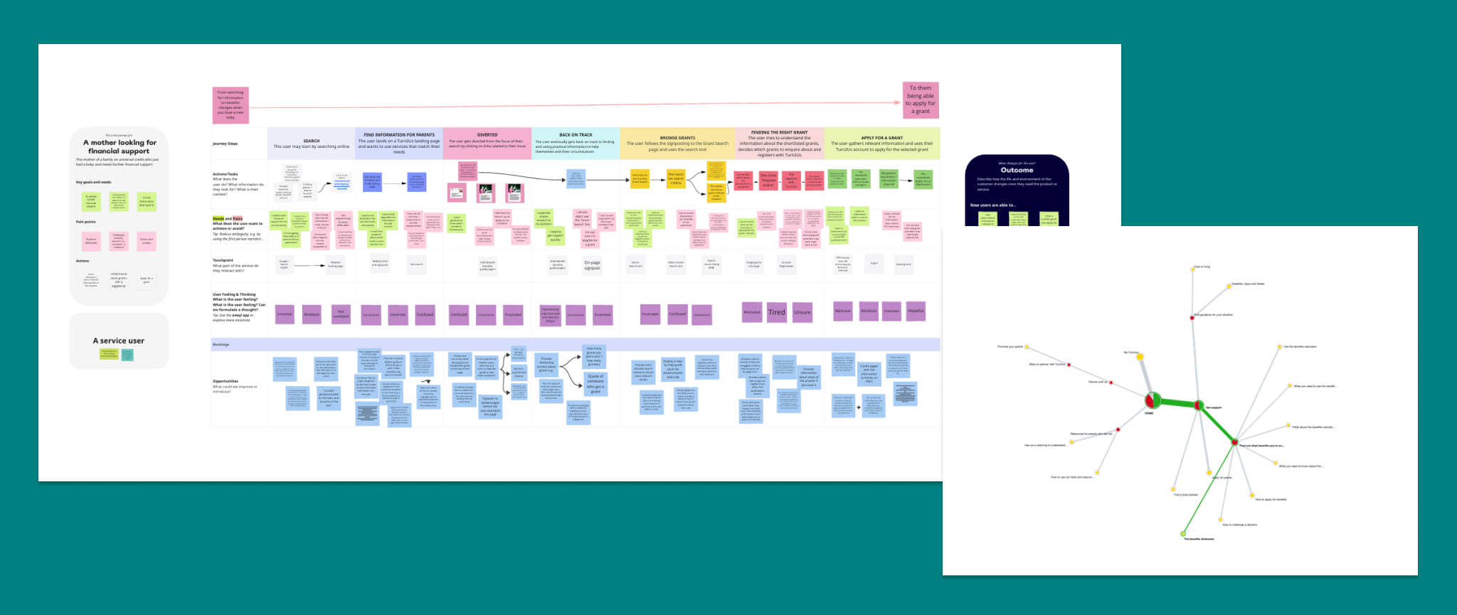
Using analytics and insights from the existing research I mapped the current user journeys, then facilitated a series of workshops with internal stakeholders to question assumptions, propose new hypothesis and steps that we could explore further with wireframes. I analysed competitors’ website layouts and structures to incorporate into the discussion during those workshops.
This was followed by two end-user surveys and a tree test study to further validate or challenge assumptions and establish a clear direction where available data was not sufficient before we moved onto redefine Information Architecture and Navigation, and sketch up the wireframes.
User journey with recommendations and a tree study’ pie tree giving us an interactive, holistic view of the participants’ journeys for each task.
“The team have been a joy to work with. Their expertise and patience were incredibly helpful and their willingness to work alongside our team to produce thorough research and incredible designs is very much appreciated. Anna and Lucia were a perfect duo to lead the project through UX research and Design.”
David Swann, Digital Project Manager at Turn2Us
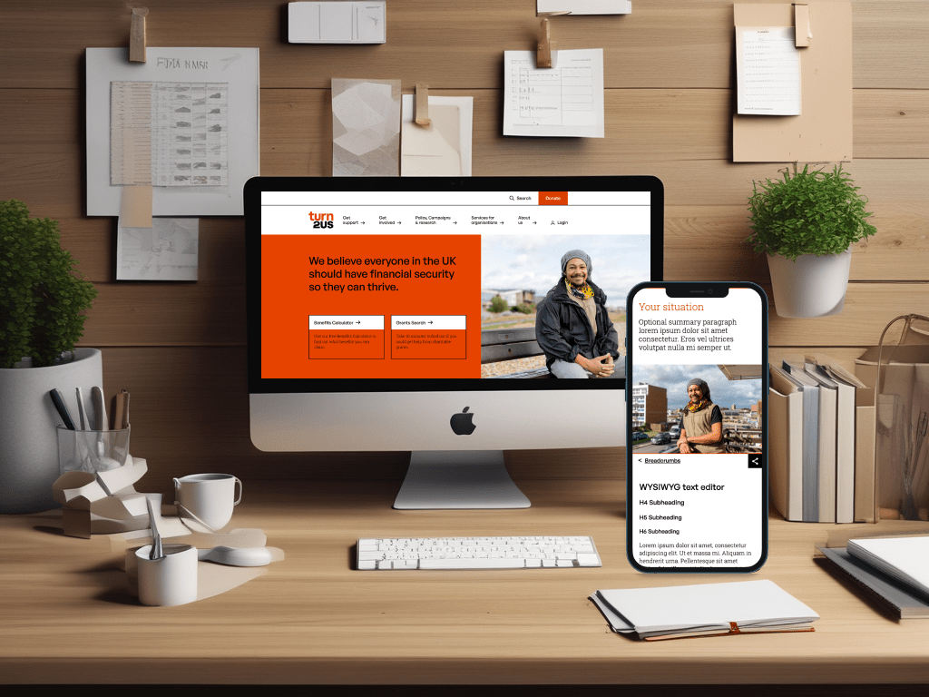
Prioritising the most vulnerable users on the homepage leads to lower exit rates
From research, we know that users who get lost looking for information on other pages navigate to the Homepage to find their way to their destination. Those also happen to be the users who are in the most vulnerable positions: in need of financial support, those having to navigate very complex bureaucratic systems, as well as a portion of users with low literacy and/or digital skills and diverse accessibility needs.
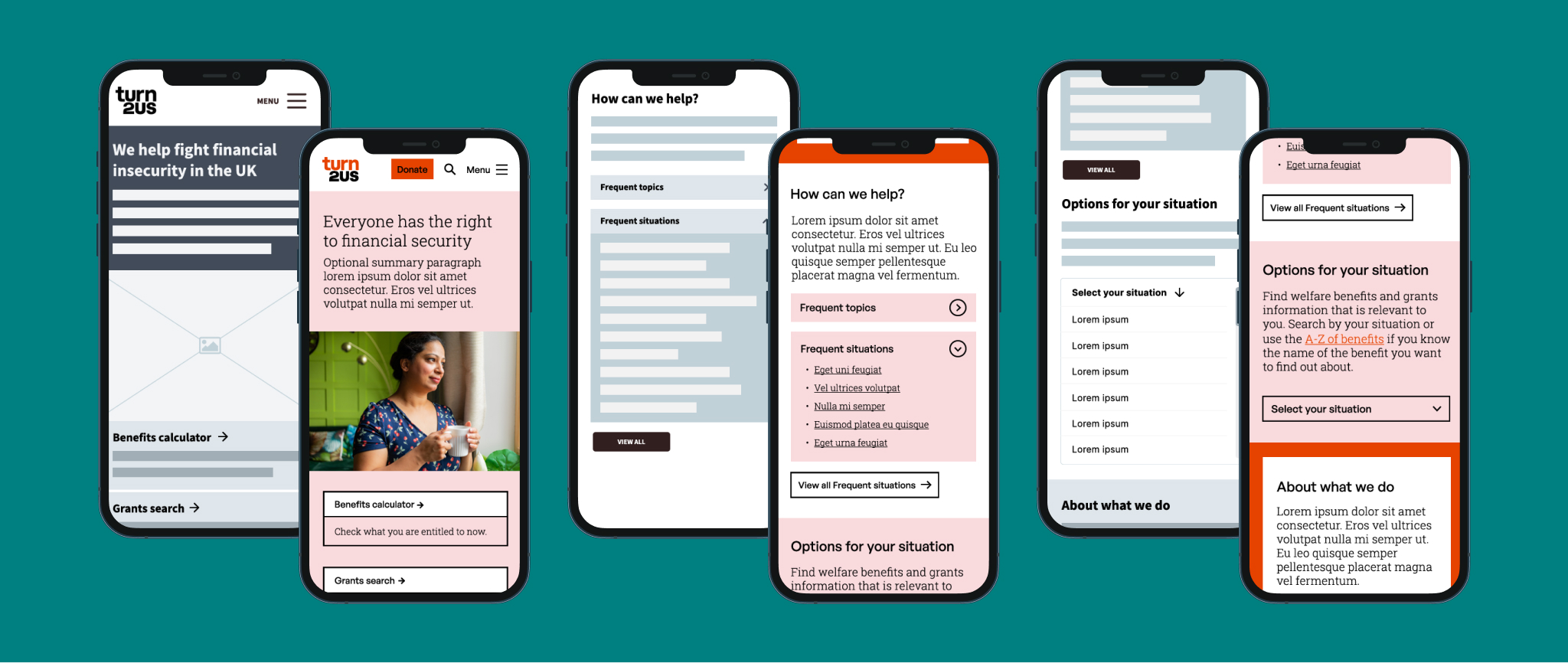
To address that, we proposed a homepage that prioritises their needs, specially on mobile devices with:
Clear and prominent signposts to the two products in most demand: the benefits calculator and the grants repository, alongside short descriptions of their function.
A signpost device with links to frequently visited pages categorised by topics and situations to meet the needs of different user types.
An Options area with a link to the A-Z of benefits as well as, more importantly, a dropdown with a number of situations for which financial help is available aimed at those users not yet familiar with benefits nomenclature.
Wireframes and prototypes of the homepage on mobile devices.
Complex content is more understandable if it follows patterns users are familiar with
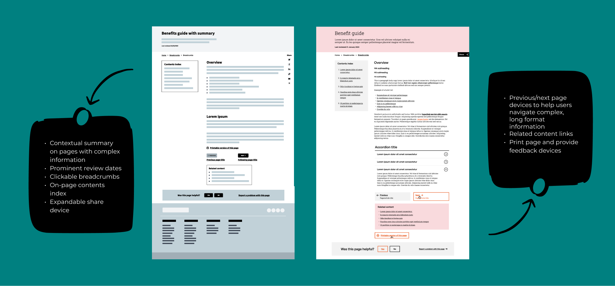
Through interview data and the user journeys we had insights as to other websites and services users were familiar with – most of which were government and NHS related. With that in mind and bearing Jakob’s law in mind: Users spend most of their time on other sites (…) so design for patterns for which users are accustomed – we simplified the benefits pages layouts to bring them closer to Government Design Standards and pages they are already familiar with.
We also introduced elements that give users further control of how they browse these pages such as contents index, next/previous buttons, related content links and the ability to print the page to read it offline.
Wireframes and prototypes of the benefits guide layout on desktop devices.
Iterating the navigation ensures the content is discoverable to users who need it
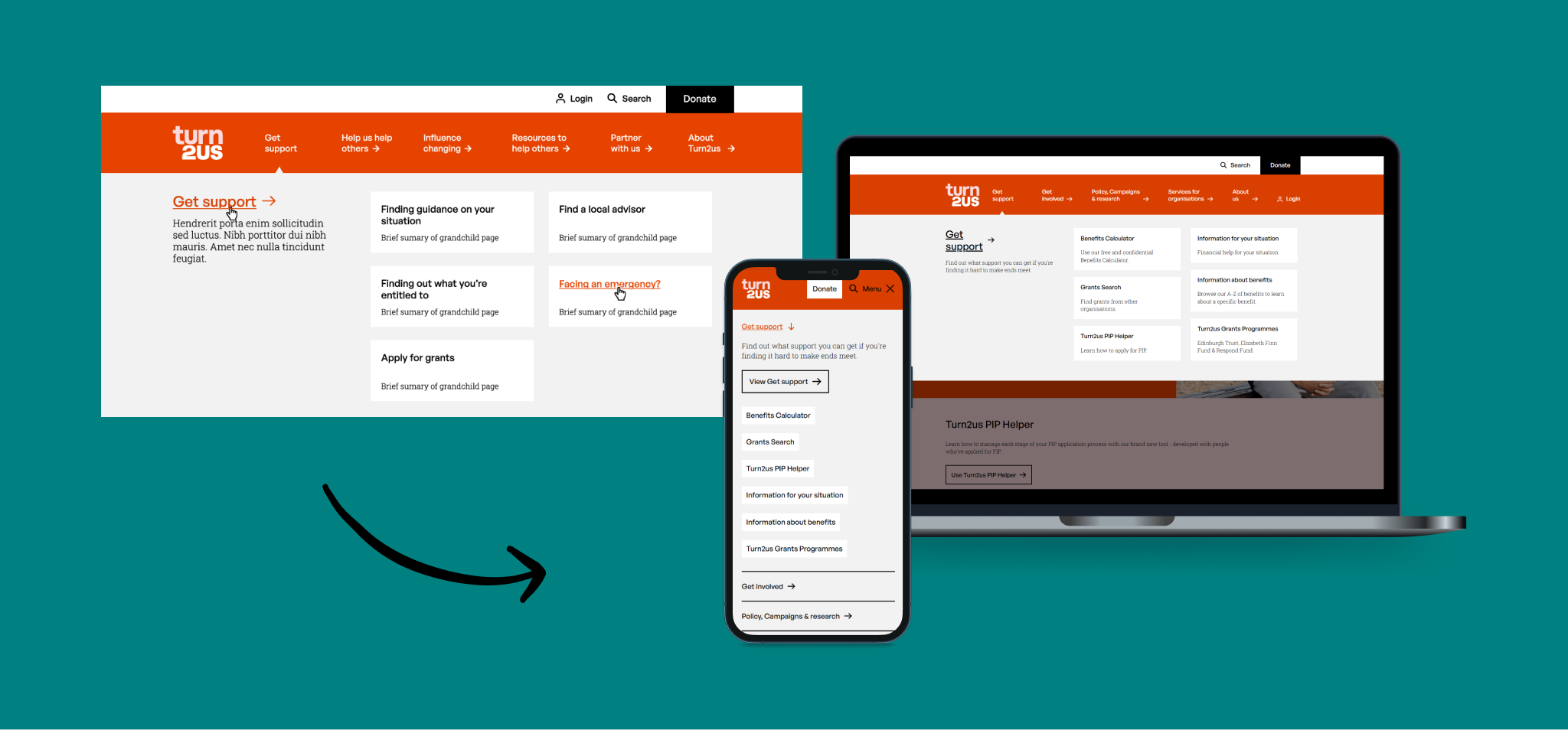
After several wireframe iterations of the navigation and a tree test study with end-users on the final version, we prototyped a full-with 2-level navigation with a key section summary visible both on desktop and mobile that provides further guidance to users as to what they can expect to find in that section.
Additionally, on desktop, short summaries of every page are also available below their titles to provide further reassurance. On mobile, these are not available since the goals of mobile and desktop users proved to be rather different when navigating the site:
Mobile users tended to either want an overview of what information is available to return to the site later on or are very familiar with the site and want to view and tap the relevant sections as quickly as possible to get to the page.
Desktop users, on the other hand, tended to spend a lot longer on the site, reading information, filling forms, using the benefits calculator or carrying out other tasks. To them, the priority was to be taken to the right pages with as few clicks as possible.
Navigation prototype (left) and current iterations of the navigation on mobile and desktop (right).
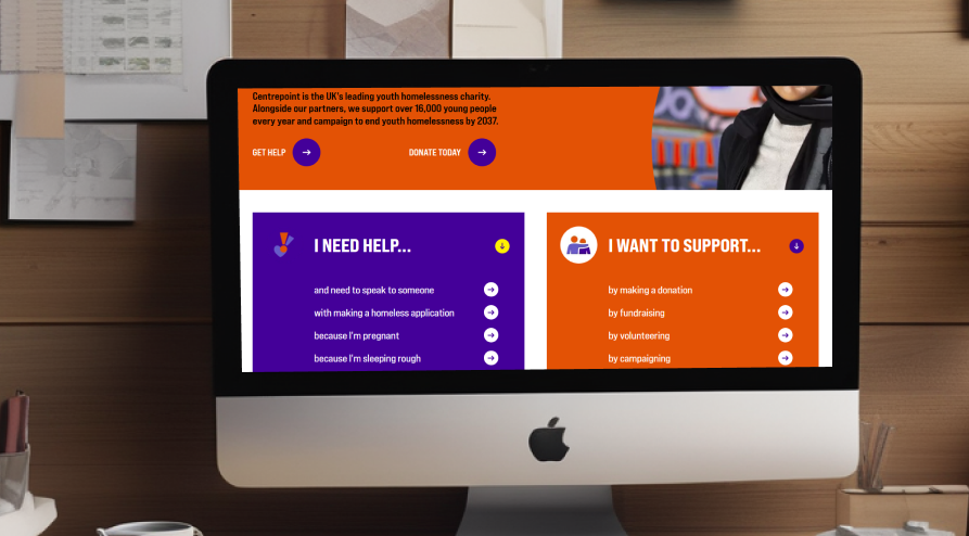
From 2022 to 2024, I led my team in conducting research projects for Centrepoint. Our findings guided the development of a user-centric website through open card sorts and surveys, user journey mapping and a new information architecture.
To be an effective leader, you need to find a good balance between ensuring the quality of the work that comes out of your department, supporting your team to keep improving their skills, and trusting them to do their best work.
I’m a seasoned user experience researcher with a passion for understanding the needs of end-users and organisations in order to deliver inclusive, accessible, purposeful, user-centric, business-aware digital solutions.


 Anna Alabau Uxer