User-centred research and design iterating to improve the services provided to users on the website and beyond.
Understanding what information users need from the website, how this information should be written to maximise understanding and where it needs to be housed to ensure discoverability is often a challenge for organisations, specially when access to end-users is limited or difficult to attain.
By focusing on improving existing user journeys (including the Information Architecture), strategically producing new content and incrementally enhancing the services provided within and without the website, Centrepoint managed to increase user satisfaction, gather more donations and get a better understanding of what services their young users expected from them in the near future.
250+
end-users participated in the research
8
user journeys mapped and optimised
13
activities including workshops, open card sort, surveys, interviews
Starting with the website to get stakeholder buy-in within the organisation
Centrepoint commissioned us to build a new website underpinned and led by user experience as a first step towards a more user-centric and evidence-based digital culture. This project helped demonstrate to internal stakeholders and senior management the value of research and insights-led decision-making, and provided further opportunities for us to work in partnership.
At the beginning of the project, I created a bespoke research plan to understand and provide insights as to user motivations, needs and pain points, specifically around 4 key areas, some of which were later explored further in subsequent projects:
Content: content topics and formats, content discoverability, information architecture and navigation.
Mobile user experience: particularly for young people and donor audiences.
Support: information and service provision via digital means and via their helpline.
User engagement: particularly around donations, virtual gifts, partnerships and campaigning efforts.
Stakeholder research was essential to co-design and to the adoption of research findings
Auditing and analysing the existing documentation and recent user research helped us design a number of stakeholder workshops aimed at fleshing out necessary information and onboard the Centrepoint team into the project. Our strategist and analyst worked with Centrepoint to establish measurable Objectives and Key Results and produced a quantitative report using Google Analytics data to benchmark the success measures we wanted to track.
To address content and user journey areas, I facilitated 3 workshops with key members of the Centrepoint team:
A content architecture workshop to understand what new content was being produced, what old content they were looking at leaving behind, and what the migration needs would be,
A stakeholder card sort to understand what assumptions the internal teams had about how users discovered and navigated the content, and
A progressive disclosure workshop to identify key calls to action, tasks and outcomes the organisation wanted users to be prompted by, carry out and see on the website
Those workshops provided value in two different ways: on one hand, they promoted a good collaborative relationship between client and agency teams that was crucial to the success of the project. On the other hand, they helped us attain a deep understanding of the organisation’s strategic goals, internal workflows and insider knowledge in a quick and cost-effective way.
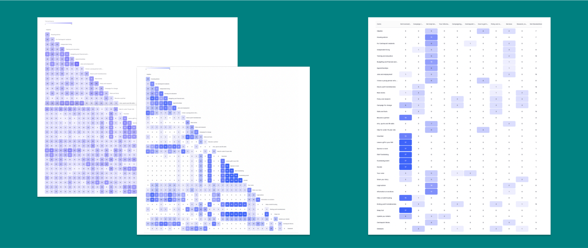
I used similarity and standardisation matrices to gather insights as to the category grouping of pages in the IA and levels of user agreement in relation to those categories.
Remote, unmoderated research gave us the best chance at including diverse and varied user insights
With 3 distinct and very different audience groups (young people in situation or at risk of homelessness, financial supporters and campaigner supporters) and limited opportunity to access a diverse representation of them face to face, I proposed conducting an open card sort study with end-users and 3 surveys (one for each audience group) to gather some initial data that validated or challenged assumptions fleshed out during the stakeholder research workshops.
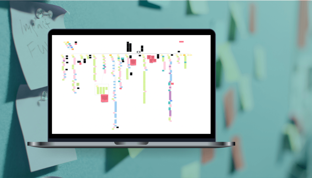
The information gathered, alongside qualitative data from their existing research, provided us with what we needed to map 8 user journeys: 4 for young people audiences including service and non-service users, and 4 for supporters, including existing and new, warm and cold supporter types, and financial and campaigner categories.
“I wanted to just say a big thank you for all your work during Discovery – for all your dedication and persistence!”
Harriet Maxwell, Website Project Manager at Centrepoint, 2023
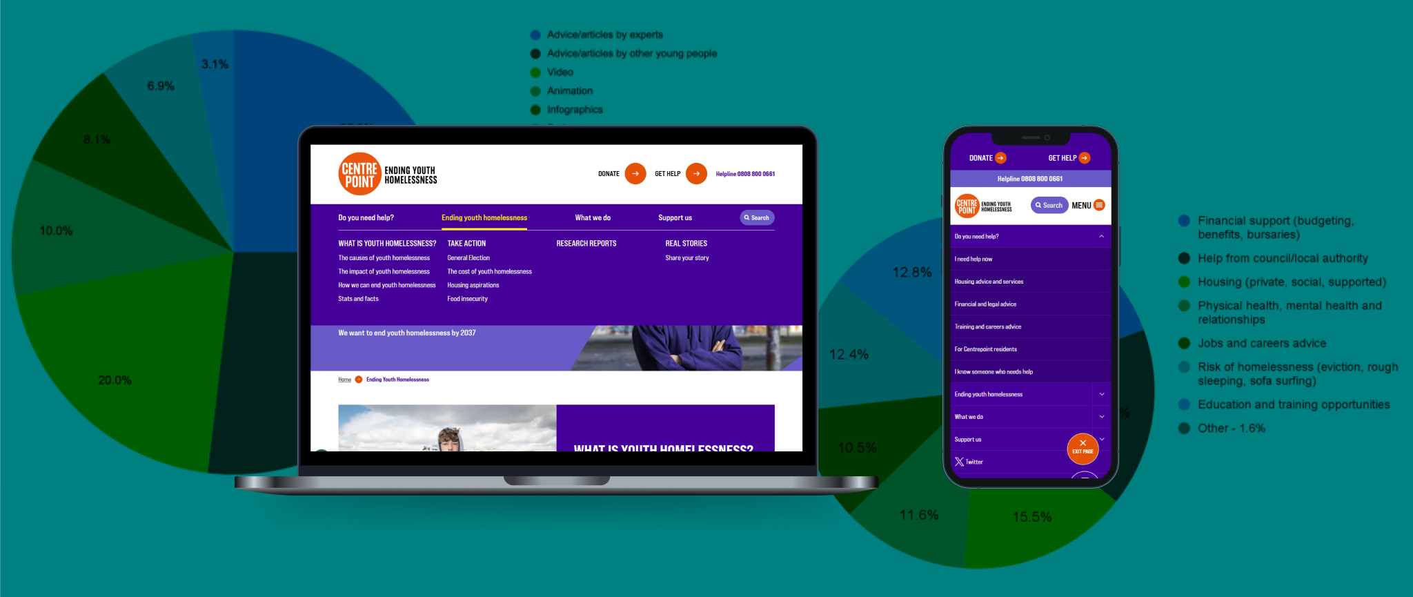
User motivations indicated what content should be in focus
We used insights from research with end-users to inform the themes and formats of the new content and the priorities for the new Information Architecture of the Centrepoint website.
We found that different user groups had quite clear ideas of what kind of content they wanted from the website:
Young people were interested in information about housing, help from local authorities and financial support, which they preferred to receive in the form of articles or videos authored by experts or peers.
Financial supporters (donors) valued financial transparency and social proof more than other aspects and along with stories, facts and figures, those were the key aspects in their decision-making process.
Campaigner supporters were motivated by lived experience stories specially in their local communities. They also valued reading from experts, specially reports – but that they wanted a variety of causes to get involved.
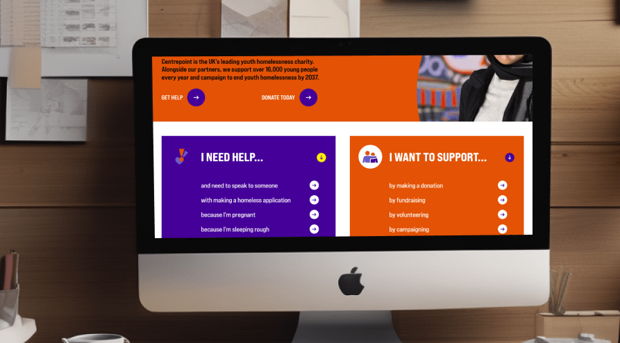
This translated into an Information Architecture that clearly organises the content into 4 key categories: Do you need help? (for young people who need Centrepoint’s services), Ending youth homelessness (for supporters, specially campaigners), What we do (for all supporters as well as policy makers and professionals) and Support us (for supporters, specially financial). This, coupled with a 3-level mega-navigation device helps direct users to the right content quicker and with less clicks, as well as allowing users to discover new content they didn’t know about.
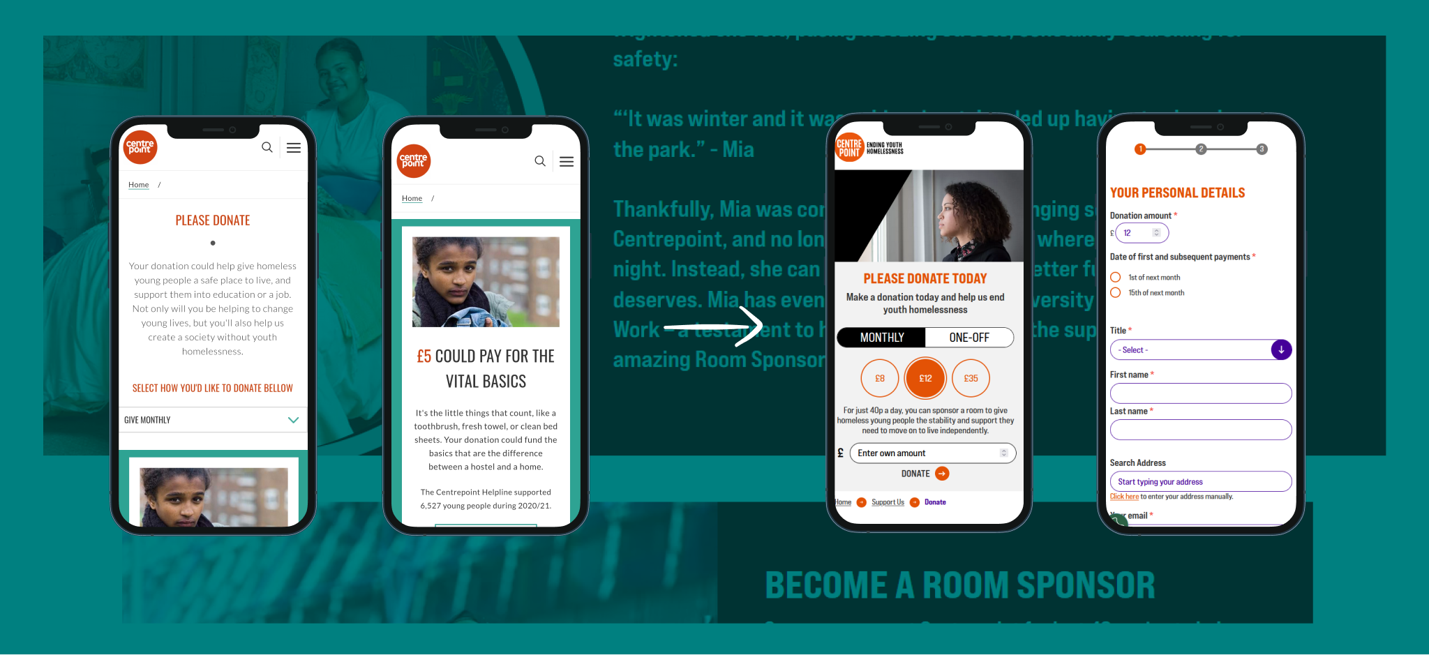
Optimising the donation journey to increase supporter engagement
Before and after of the Donation pages, specially on mobile, with the journey optimisations recommended by UX research during discovery.
One of the big focus areas of this project was to increase user engagement in supporter-related journeys and improve the experience with those on mobile devices.
UX research and design came together to first wireframe, then prototype, specify and finally create an optimised user journey that led to higher conversions from regular and ad-hoc donors both on desktop and mobile devices.
Key improvements included:
Removing the navigation tabs to keep users focused on the donation process once they’ve made the decision to donate
Creating a much more compact donation selection device displayed above the fold for users to select frequency and amount of their donation
Showing steps on the donation process, which loads in one single page base on the user’s interaction with the fields
Tokenising the data captured to display personalised thank you messages and communications at the end of the payment process
Engaging in further research to support the improvements of services for their beneficiary audiences
After the website project and thanks to the valuable insights derived from the website’s research, Centrepoint commissioned myself and my team for another two key pieces of work:
SEO and content consultancy to help them create new content young users wanted to see on their website and make it discoverable within the navigation and the information architecture.
User Experience research into specific user flows and service delivery methods, for which we conducted 5 user interviews with young service users to gather insights as to the use and usefulness of the helpline, the web chat and the potential introduction of Artificial Intelligence onto the website.
I’m a seasoned user experience researcher with a passion for understanding the needs of end-users and organisations in order to deliver inclusive, accessible, purposeful, user-centric, business-aware digital solutions.
To be an effective leader, you need to find a good balance between ensuring the quality of the work that comes out of your department, supporting your team to keep improving their skills, and trusting them to do their best work.